Google has offered a better android experience with the Android 12′ release and the introduction of Material You. This excellent new design allows the users to experience several features like a more dynamic touch ripple, a silky-smooth scroll, and a spacious layout. Personalization is a defining trait of an android with the Material You.
What is Material You?
Material You is the latest design language & framework of Google. It is called Material Design 3. This design language is applied across Google products such as the Pixel Watch and even smart displays.
Material You Features:
Bolder Widgets:
Google improved the home display widgets when they released Android 12 and Material You. Widgets come with rounded corners and are compatible with device theming. Besides, this supports completely dark mode. On the Google mobiles, widgets change the color based on the location where you will place these on your home display.
Refined Notification Panel and Animation:
However, a reduction in the number of settings toggles can be seen and these need to be organized into a grid with labels rather than a row of icons.
The Individual settings look like bubbles. You can use the dominant Material You color to know if these are enabled or not. The visual treatment is the same for notifications to match Material You’s rounded aesthetic. For making the users feel more natural and responsive to user input, Material You has brought refinements to animations. For instance, as soon as you wake up, the screen will light up.
Improved Accessibility:
Google included some new accessibility features to Android with the latest design framework. The change is mostly seen in the default Android Settings app. It can push down the first menu entry to the display’s midsection. As a result, it becomes easier to reach one-handed on the bigger devices. Samsung adopted the accessibility feature with the One UI skin on Android 12 first.
Design Changes:
This design language has new UI elements tracking the current design trend of bigger visual elements. Therefore, the entire design is open to all and approachable. It can include tension to find balance in phone UIs where information density is greater. Creamier and warmer palettes exchange pure whites, whereas hard edges are replaced with rounded corners. With the help of the updated visual language, it is possible to improve overall UX.
How to Change the Material You Color Scheme on Android?
If you are willing to change its color scheme on devices that run Android 12 or newer, you should go through the steps.
- Your first task is to open the Settings app.
- Then, you need to head toward the Wallpaper & style section.
- Now, you should choose new wallpaper with your preferred color scheme.
- A new section appears towards the bottom. Depending on the wallpaper, you can choose some color palette options.
- You may not like the options which are available already. In such cases, you should move to the Basic colors tab. Then, you have to choose the accent color.
- A little preview appears at the top displaying how the color scheme on different apps looks like. If you find the look satisfying, you can click on Apply.
Finally, you can see the chosen Material You color palette taking effect across Android UI and Google apps.
The Easiest Approach to Theming Imaginable:
Google has experimented with custom themes for a long time on Android 10 and 11, where you can change icons, shapes, fonts, and colors for some system UI elements. It is a bummer that Android 12 brought everyone to the default round icons because it lost its ability. But Material You is very easy to use. Just set new wallpaper and allow it to do its magic. You can select from up to three alternative custom color palettes and four standard colors. Every Android app would introduce Material You elements so that users can have a unique experience while using any app. We all know that Google is really fast regarding support for its own apps. As a result, we get a glimpse of how Android will look in upcoming years.
Is Material You Available On All Android Phones?
Although color extraction was billed as a headlining feature, the theming engine was not available in the AOSP build of Android 12. The company even did not include monet to AOSP until Android 12L’s release in March 2022. Therefore, devices like Samsung and OPPO must create their own color extraction systems in time for their Android 12 updates. If you are a user of a non-Pixel smartphone, it is possible to see color extraction, at least on Android 12 and higher versions.
Pixel mobiles with Android 12 update can access Material You. It adds the Pixel 3 through the Pixel 6. You should know that Google mobiles will be the first one to get any new updates to Material You like new colors. While Android OEMs mostly offered color theming and a wallpaper color picker tool in Android 12, these did not depend on Monet or Material You. For instance, Samsung’s One UI 4 features Dynamic Color that can mirror Google’s color picker tool. However, both are not the same.
In 2022
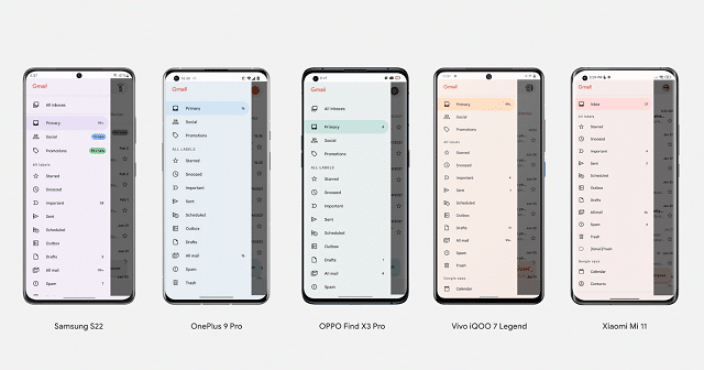
It was February 2022 when the company announced that Material You would be available on other Android mobiles like Samsung, OnePlus, Oppo, Vivo, realme, and Xiaomi. As a result, Monet became open source starting with the Android 12L release. Later, as per a requirement it was decided that phone brands need to start incorporating Material You (or a few equivalent design language) to every Android 12 phone moving forward.
Galaxy S22 phones and Galaxy Tab S8 series were the first mobiles to have Material You. But you should know that all Samsung mobiles on Android 12 didn’t receive the Google-backed version. The changes of Android 12L will be available on the One UI 4.1.1 and come with more Material You design features for Samsung mobiles.
The same thing is applicable to ColorOS 12, OxygenOS 12, and the other OSs. All of these created some design language changes to incorporate the color picker tool & dynamic colors. But it did not happen with Material You or Monet. That’s why Google asks OEMs to use its tools. However, it is expected that these will not be available until they are updated to Android 12L or Android 13.
Top Seven Best Material You Apps for Android:
-
Files by Google:
Replacing the stock apps with those offered by Google is a good way of incorporating the new Material You design into daily usage. This one is a useful file manager which comes with a clean user interface to do its task.
It comes with the edge of Google’s freakishly smart personalized suggestions, and knows about your storage requirements over time. It advises you to let you learn how to clear the phone up. The app allows you to analyse all media stored on the mobile. Then, your task is to put these into categories, including downloads, large files, and even memes.
Now, you are one tap away from removing all the redundant files that have been clogging up your mobile storage. The file manager comes with a safe folder where it is possible to store information-sensitive files.
-
Google Messages:
If you are a non-Pixel mobile user, you may know that the installed default messages app that you can find on the device is not distributed by Google. Material You theming is one of the most useful features added to the Messages app by Google. This one is more prominent than the previous one. Besides, it can showcase the phone’s accent color in a better way. Despite being bare-bones for the longest time, this app uses the smart predictions of Google to sort the inbox into different categories like OTPs, promotional SMS, conversations, etc.
-
Gboard:
This is another famous Google app that received the Material You theming. You should know that keyboard apps come with different sets of unique features. But based on its unique features and facilities, we expect Gboard to replace all of them. The app includes customization, swipe typing, an emoji kitchen, GIF support, stickers, etc. On Android 12, the app follows the system’s accent color.
-
Sleep as Android:
Let’s steer away from apps that are made by Google and have a look into those apps which are crafted by other developers. If you are looking for a sleep-tracking app on the Play Store, this app is the best one. With the help of this all-in-one application, it is possible to monitor the naps. Besides, it comes with the wearable support for detecting parameters such as your heart rate and SpO2 level. The app needs a CAPTCHA (or a maths quiz) for disabling or snoozing the alarms.
You will feel the app is brand new whenever you switch your wallpaper. As soon as you log the sleep for the night, it is possible to see different stats determining the sleep score. With the help of its premium version, you can unlock some other features. However, the free versions can suffice most people.
-
Infinity for Reddit:
While we can hardly say that Reddit users agree on one thing, we can say that the official app for Android leaves plenty of things to be desired. All the blessings of Material You theming can be found in Infinity for Reddit. It comes with an easy-to-use interface, whereas most options are stuffed away in the hamburger menu. It is possible to sort posts by the normal filters like top, controversial, new, and hot. The app includes a “Lazy Mode,” which can automatically scroll posts for you.
In this case, you need to enable Material You theming manually. If you want to find the Material You theming, head toward Settings and then you need to go to Theme. This app comes with a few options to customize the interface, such as boosting content padding, rearranging tabs, etc.
-
Inware:
This app is designed for the geeks within us. The app has nearly all information related to the devices, like hardware and software. The app will offer great insight into the device if you care deeply about specifications. It showcases some parameters, including the phone’s screen size, resolution, refresh rate, processor, fair amount of RAM, battery backup, and camera specifications. Moreover, the application informs you if the mobile is compatible with Project Treble or not. Material You theming with a dark theme makes the app interesting and fun to use.
-
Swift Walls:
This one uses Material You theming in and around the app. There is an option to preview wallpaper, which makes the app unique. Besides, there is an option to complete with the change in the accent color. Moreover, you can see how the wallpaper on various home screens looks like. The app lets you tweak your wallpaper with filters and blur tools. However, the wallpaper library may disappoint you. But as it is a new app, we expect that more wallpaper will be added later. Nevertheless, it can offer a pleasant wallpaper to tweak the experience.
The Bottom Line:
Google needs Android OEMs to create the Material You theming into their mobiles. While pixels have got Material You features first, android developers can spin off the theming versions by trying something exciting. People who purchase a mobile that updates Android 13 or beyond upgrade can see design changes over time.
Frequently Asked Questions:
What is the material about you?
It is the new unified design language which was introduced with Android 12.
What is the difference between the material you and material 3?
Android 12 was released in May 2021, but the announcement from Google was made in late October with a complete design language called Material Design 3 which is the technical name of Material You and was unveiled via a Pixel 6 ad at the beginning of 2021.
Is Material You open source?
Yes, its Monet theme engine of Material You is open source with Android 12L.


