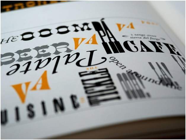
Typography is an important design element that can greatly impact the effectiveness of a presentation, whether that’s a marketing social post or a medical report. Think about it: you wouldn’t submit your dissertation with a Comic Sans font. That’s because fonts help convey key messages and set the right tone, so with that in mind it won’t surprise you how much marketers take to carefully choose or even curate the perfect font for their presentation. But why? Why is the typography of your visual items so important? What is it that your mind is picking up from looking at the same letters you see everywhere, but… pretty? Take a look at our guide to the psychological impact of typography on your reader and what you can do to tailor your message with font.
Create a Profile
Font style and size influence the mood and tone of a presentation. Serif vs sans-serif, decorative vs plain, large vs small fonts all create different impressions. It’s important that you choose fonts deliberately to put across the right message.
However, that starts with understanding your message. Like anything else you make for an audience, you need to know who you’re talking to and what you want to put across to them. Think about their age, gender, ethnicity, location, socioeconomics and going further, their values, interests, and access to your product. All of this will inform every aspect of your design, even the font.
For example, fonts that are sleek and simple come off as sophisticated and professional, fonts that are curly or bubbly appear feminine, and fonts with more detail and flourish come off as traditional. The key is choosing a font personality that reinforces the desired brand or media image. Designers should experiment with evocative typography to find the right fit, such as with the software DaVinci Resolve, which is like Canva for text.
Images and Text
You can really have fun with fonts for titles and headers. When it comes to brands, for example, a lot of brand names are entirely unique fonts with unique features. Some make a word out of an image, or take an image’s inspiration for the font, mostly found in logos.
And then there’s color theory. Like any other aspect of design, it’s an important part of keeping your message legible but also putting across a message subconsciously. We know blue means sad and calm, red means angry or passionate, yellow means happy and green means nature. That’s scraping the surface but it’s something to keep in mind when you are designing even your font. But it’s also about making it easy to read. The standard is black text on a white page not because paper is naturally white, but because it’s easy to read. You’re going to have different results when experimenting with color in your typography.
Examples
So, where is your starting point when it comes to fonts? There is the theory, but then there are so many fonts out there with minute variations that it makes you cross-eyed scrolling through them all. Who remembers the names of fonts beyond three big players? Well, we can help you out with a few ideas.
For instance, sans-serif fonts like Helvetica convey modern, clean simplicity. They give a minimalist, uncluttered impression. Brands like Apple use these fonts for their sleek, tech-forward image. And then there are serif fonts like Times New Roman, which are more traditional and formal. They suggest heritage, class, and professionalism. Law firms and universities often use serif fonts to project authority.
Script and handwritten fonts imply personality, creativity, and elegance. Brands like Coca-Cola use these fonts to come across as friendly, human, and organic, which has served a monopoly company well. You can even make your own font with Adobe Illustrator, or platforms like Calligraphr.
Bold, thick fonts are bold and confident. Weighty fonts suggest strength, reliability, and solidity. Automotive brands favor these fonts to project power and performance. Additionally, narrow and condensed fonts feel streamlined and efficient. Their compact letterforms give an impression of speed and forward motion. Athletic brands often rely on these fonts to infer energy.
Blackletter fonts look old-fashioned, gothic, and medieval. Music and entertainment brands use them to be edgy, dark, and countercultural. On the other hand, playful display fonts with unique shapes add fun and youthful spirit. Toy companies, confectioners and children’s brands use these fonts to be silly, colorful, and lively – or even make their own.
Conclusion
However, there is a double-edged sword to this. If your typography is too …creative, and it isn’t for the purpose of anything bigger than a header, you can cause a headache in your reader as they try to read your text. Thoughtful typography optimizes presentations for readability, comprehension, and reinforcement of core messages if done right. We encourage readers to focus more on these impactful design elements when it comes to bigger messages and stick to something sans-serif for the body of text.


